A Less Scary Introduction to CSS
October 27, 2019
CSS can be scary for some people. This post is a simple introduction to some intermediate CSS concepts.
I am assuming you already know the basics of HTML and CSS. Meaning you already know how to write simple CSS. If not, take a look at W3School’s HTML and CSS labs.
Quick refresh
Let’s start by refreshing your memory on some basic concepts.
CSS stands for Cascading Style Sheet. A CSS rule consists of a selector and a block of style properties and their values. Example:
div {
  color: red;
}
In the example above div is the selector, color is a style property and red is the property value. This rule means: for div elements set the text color to red.
This is a simple example of a really simple CSS rule. Now that your memory is refreshed, let’s dive in.
CSS selectors
CSS selectors are what tell the browser what styles to apply to which HTML elements. Basic selectors are:
*: this matches all elements.- Type selector: matches all HTML elements with the specified element type.
divis an example as shown above. - Class selector: matches HTML elements having the specified class name. These selectors start with a
.followed by the class name. Example:.myclass. - ID selectors: matches an HTML element with the specified ID. These selectors start with a
#followed by the ID. Example:#myDiv. This will match the element withid="myDiv". - Attribute selector: matches all HTML elements having the specified attributes and optionally their values. These selectors look like
[attributename=value]. Examples:[required]will match all elements having therequiredattribute, regardless of its value.[type=text]will match all elements having thetypeattribute with its value set totext.
You can write rules that use a mix of the selectors above. For example: .myClass[required] will match all elements having the class name myClass and the attribute required. You can also group selectors to match multiple element types. To group selectors, separate them with a ,. For example: .myClass, #myDiv, h1 will select all elements having .myclass class, the element with id="myDiv" and h1 elements.
There are other types of selectors, like pseudo-class selectors, and different combinations of selectors, like sibling combinations, child combinations, and descendant combinations. For a complete guide and reference for CSS selectors, see MDN CSS selectors reference and W3School CSS selectors guide.
CSS selector specificity
Browsers have rules to apply CSS styles. If two CSS rules are conflicting, browsers use these rules to choose which styles to apply. More specific styles are more likely to override less specific styles. Understanding CSS selector specificity is important because it affects the way you write your CSS.
Specificity can be explained in 4 basic categories, arranged from most specific to less specific:
-
Inline styles: Inline styles will override any other styles. An example:
If in your HTML:
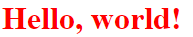
<h1 id="redTitle" style="color: blue">Hello, world!</h1>In CSS:
  #redTitle {
    color: red;
  }
The resulting text will have a blue color:
-
ID selectors
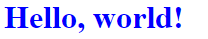
<h1 id="redTitle" class="blue-title">Hello, world!</h1>In CSS:
  #redTitle {
    color: red;
  }

  .blue-title {
    color: blue;
  }
The resulting text will have a red color:
-
Classes, attributes and pseudo-classes
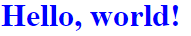
<h1 class="blue-title">Hello, world!</h1>In CSS:
  h1 {
    color: red;
  }

  .blue-title {
    color: blue;
  }
The resulting text will have a blue color:
-
Element selectors
For rules with equal specificity, the latest rule will be counted.
This is CSS specificity at a high-level. For more elaborate examples to understand and calculate CSS specificity, read this excellent article.
The box model
Browsers render every element as a box. If you ever tried to inspect an element in a browser, you probably saw something that looks like this:
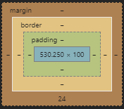
As you see in the picture, the box model consists of 4 different areas:
- Margin
- Border
- Padding
- Content
Understanding the box model allows you to build accurate layouts. By default, when you set the height and width of an element, you are only setting the content height and width. To Calculate the total height or width of an element, you must consider all 4 areas. For example:
h1 {
  margin: 10px;
  border: 1px solid black;
  padding: 5px;
  width: 100px;
}
The total width of the element = (10 * 2) + (1 * 2) + (5 * 2) + 100 = 132px. Margin, border, and padding are multiplied by 2 to consider both left and right.
You can change this behavior by changing the value of the box-sizing property. By default, box-sizing value is set to content-box, which makes the browser behave as explained above. The other value of the box-sizing property is border-box. border-box includes both border and padding into the width calculation. For example:
h1 {
  box-sizing: border-box;
  margin: 10px;
  border: 1px solid black;
  padding: 5px;
  width: 100px;
}
The total width of the element = (10 * 2) + 100 = 120px. But where did the border and padding go? Well, because the box-sizing is set to border-box, the browser determined that the width of the element includes both the border and padding. If you inspect the element, you will find that the content area width is 88px (not 100) with 1px borders and 5px padding on each side.
CSS Units and Percentages
In CSS you use a handful of units to determine length. These units can be split into absolute, relative and percentages. An example of an absolute unit is the widely used Pixel (px) unit. There are other examples of absolute units but I personally never seen anyone use them. Example usage:
h1 {
  font-size: 16px;
}
The most popular relative units are: em, rem, vw, and vh.
An em is a unit relative to the font-size of the element being styled not its parent. For example:
h1 {
  font-size: 16px;
  margin: 2em;
}
The margin of the element will equal 2 (em) * 16 (font-size) = 32px. It is advisable to use em when you want to scale an element depending on a font-size other than the root element.
A rem is a unit relative to the font-size of the root element (html element). For example:
h1 {
  font-size: 20px;
  margin: 2rem;
}
Considering that the default font size in a browser is 16px, the element’s margin will equal 2 (rem) * 16 (root element font size) = 32px. Notice that the element’s font size did not affect the calculation. It is advisable to use rem to make sure that your layout scales regardless of the user’s font size. Here is an in-depth read comparing em and rem.
vw and vh are relative to 1% the viewport width and height respectively. The viewport is the browser’s content window size. Be careful when using these values, a 100vw is not the same as 100%. For example, if you set an element’s width to 100vw the actual width of the element will be the viewport width including the scroll bar width.
Percentages are always relative to the parent element. If you set an element’s font-size to 50% it will be 50% of the parent’s font-size, if you set the element’s width to 50% it will be 50% of its parent’s width.
For a more comprehensive guide into CSS units and percentages, you can take a look at MDN documentation.
Conclusion
CSS is vast and has a lot to uncover. It takes time to learn and master. You will need to do a lot of reading and practice. Once you start to get the hang of it, you will enjoy building beautiful sites with amazing layouts. There is a lot that I wanted to write about but I did not want to over-stuff it in a single post.